This article belongs to BUSINESS MONTH: Creativity theme.
The office has long been a dull gray space, devoid of creativity and paneled with a substance scientifically proven to absorb men's souls. Bored office workers often have nothing to do but to sit around, pushing pennies up their bottoms and taking bets on what rate of interest they will earn. Many managers and team leaders have tried to introduce fun into the working environment, arranging 'wacky tie' days, office parties and sexual harassment charges. Unfortunately, such tired efforts can lead to contempt, self-harm and even premature death.
But why should the office be a dull and tedious place? What stops it from being an enjoyable place to work? Aside from the people, that is.
Introducing fun and creativity to the office has been a long studied scientific conundrum. Fortunately, however, the answer seems to be simpler than you might think. Simply make the office building its self more exciting.
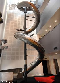
One construction company in Sheffield, one of England's 'grim up north' ex-industrial cities, has designed an office block with just this in mind. They've even gone so far as installing an 87ft long helical slide into their new building. The slide travels 40ft from the buildings communal 'club' area to its lobby and reception desk. It is hoped that this fairground feature will not only encourage businesses to rent space in the Electric Works office complex, but also help to increase the productivity of those businesses by providing them with a creative atmosphere. Employees have the option of avoiding the stairs and elevators altogether and taking the faster way down.

Designer Toby Hyam has said that the slide is a 'statement about risk-taking'. He also admitted that 'it will be a novelty at first, and we don't know whether it will wear off, but if you are having a meeting with a client and people are whizzing past, it will be memorable.'
One drawback to the design, that nobody seems to have pointed out so far, is that the slide travels from the third floor communal area of the office complex to its exit. This will invigorate employees leaving their offices on an evening but do nothing to stimulate their creativity as they arrive.
Of course this three story novelty, and it is just that, pales in comparison to the creative workspaces of other media corporations. Animation giant Pixar is surely the top dog in this regard. Their huge complex in Emeryvile, California features a huge atrium and provides it's employees with foosball and pingpong tables. Various sporting facilities are also included in the complex, allowing the creative minds of Pixar to literally stretch their leg by playing football or basketball, or by taking a relaxing dip in the company swimming pool.
Pixar also goes one step beyond in educating it's employees. This is done in the Pixar university building, adjacent to the main building. Now there's somewhere I'd like to study.
This new trend in providing creative workspaces has even hit the world of politics. One of the most creative building to have ever been constructed is the new Scottish parliament building at Hollyrood. This bizarre building looks like a junkyard of glass, wood and steel from the outside and from the inside has all the coordination of a mentally disabled harlequin. David Bowie would really be at home in the labyrinthine corridors of Hollyrood. Walls, floors and ceilings are all painted in the styles of Picasso and Escher, creating optical illusions that are said to make visitors and politicians alike feel uneasy and faint. You might think that it's not easy to topple a burly Scotsman but I can tell you that it happens all the time. They spend half their lives drunk and walking like crabs; sideways, backwards and often upside down. This imaginative architectural masterpiece captures the Scottish mindset perfectly.
Exactly what the architects of this building are trying to communicate, I'm not sure. They would have you believe that they are making a statement about a 'bold new Scotland'. Personally I think they are expressing the sensation of Scotland being a confused entity with a confused history. The image of a nation with more aesthetic value than any real worth. Either that or they wanted the entire Scottish parliament to vomit uncontrollably and go crawling back to Westminster in search of stomach pills.
Does this new technique work? Can the spaces in which people work really have a positive impact on the business as a whole? Will the Scottish start thinking creatively and finally stop being so petty? Only time will tell.
But why should the office be a dull and tedious place? What stops it from being an enjoyable place to work? Aside from the people, that is.
Introducing fun and creativity to the office has been a long studied scientific conundrum. Fortunately, however, the answer seems to be simpler than you might think. Simply make the office building its self more exciting.
One construction company in Sheffield, one of England's 'grim up north' ex-industrial cities, has designed an office block with just this in mind. They've even gone so far as installing an 87ft long helical slide into their new building. The slide travels 40ft from the buildings communal 'club' area to its lobby and reception desk. It is hoped that this fairground feature will not only encourage businesses to rent space in the Electric Works office complex, but also help to increase the productivity of those businesses by providing them with a creative atmosphere. Employees have the option of avoiding the stairs and elevators altogether and taking the faster way down.

Designer Toby Hyam has said that the slide is a 'statement about risk-taking'. He also admitted that 'it will be a novelty at first, and we don't know whether it will wear off, but if you are having a meeting with a client and people are whizzing past, it will be memorable.'
One drawback to the design, that nobody seems to have pointed out so far, is that the slide travels from the third floor communal area of the office complex to its exit. This will invigorate employees leaving their offices on an evening but do nothing to stimulate their creativity as they arrive.
Of course this three story novelty, and it is just that, pales in comparison to the creative workspaces of other media corporations. Animation giant Pixar is surely the top dog in this regard. Their huge complex in Emeryvile, California features a huge atrium and provides it's employees with foosball and pingpong tables. Various sporting facilities are also included in the complex, allowing the creative minds of Pixar to literally stretch their leg by playing football or basketball, or by taking a relaxing dip in the company swimming pool.
Pixar also goes one step beyond in educating it's employees. This is done in the Pixar university building, adjacent to the main building. Now there's somewhere I'd like to study.
This new trend in providing creative workspaces has even hit the world of politics. One of the most creative building to have ever been constructed is the new Scottish parliament building at Hollyrood. This bizarre building looks like a junkyard of glass, wood and steel from the outside and from the inside has all the coordination of a mentally disabled harlequin. David Bowie would really be at home in the labyrinthine corridors of Hollyrood. Walls, floors and ceilings are all painted in the styles of Picasso and Escher, creating optical illusions that are said to make visitors and politicians alike feel uneasy and faint. You might think that it's not easy to topple a burly Scotsman but I can tell you that it happens all the time. They spend half their lives drunk and walking like crabs; sideways, backwards and often upside down. This imaginative architectural masterpiece captures the Scottish mindset perfectly.
Exactly what the architects of this building are trying to communicate, I'm not sure. They would have you believe that they are making a statement about a 'bold new Scotland'. Personally I think they are expressing the sensation of Scotland being a confused entity with a confused history. The image of a nation with more aesthetic value than any real worth. Either that or they wanted the entire Scottish parliament to vomit uncontrollably and go crawling back to Westminster in search of stomach pills.
Does this new technique work? Can the spaces in which people work really have a positive impact on the business as a whole? Will the Scottish start thinking creatively and finally stop being so petty? Only time will tell.
|
|


